Modern Tudor Living Room
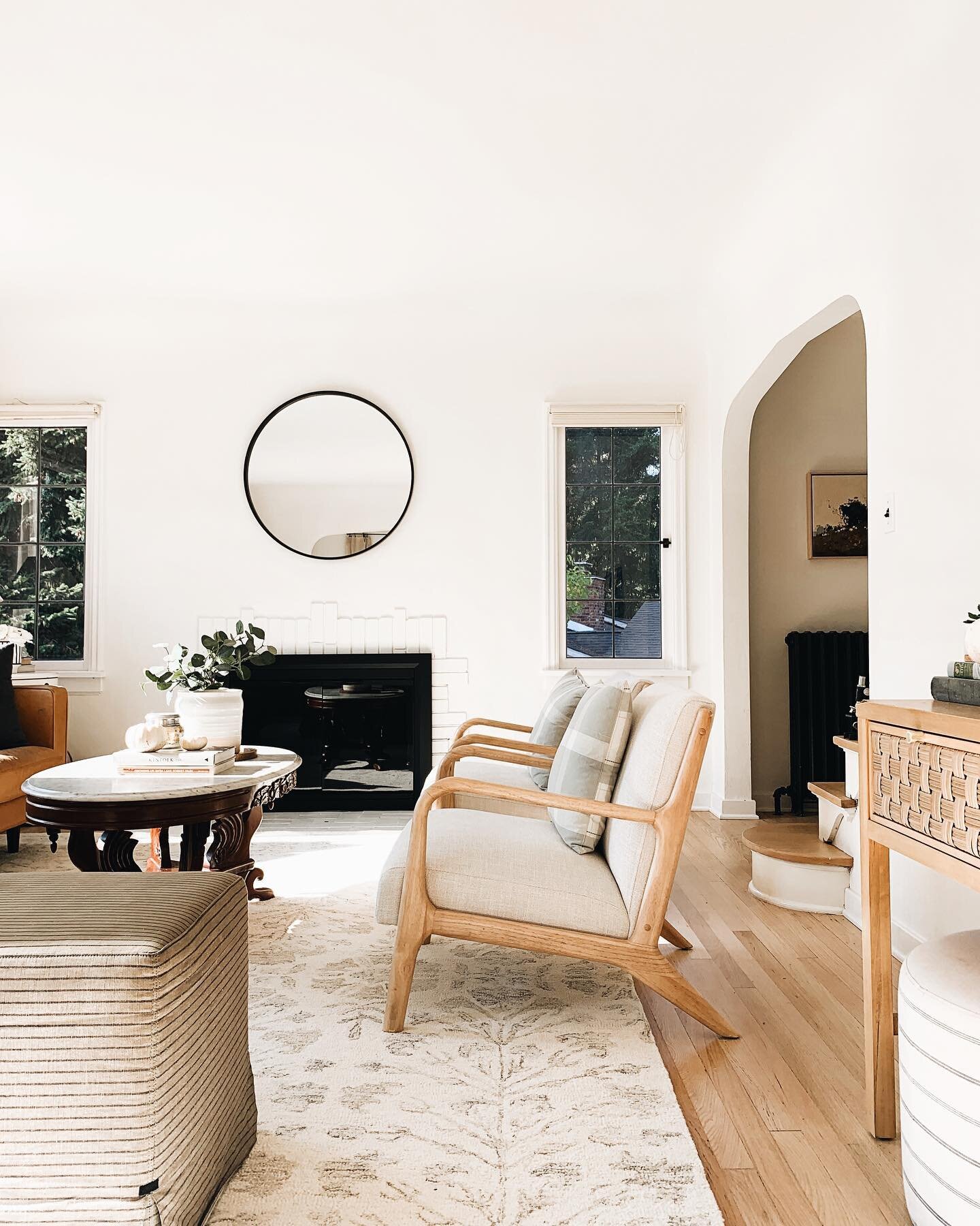
/My first official design board! Hugely exciting day. This is the start of our modern Tudor living room. It’s a mix of old and new, with rich textures and tones. Mostly second hand, but you can shop very similar (or in some cases, exact!) items below the post.
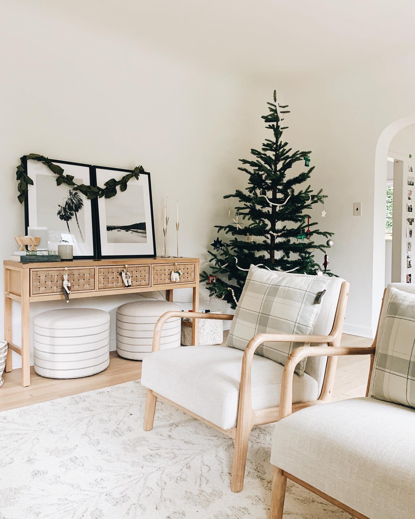
We had the couch so we started there (and it looks nothing like the stock photo since my kids have used it as an indoor trampoline for years. It’s well worn and well loved!). I found the antique marble and mahogany coffee table on OfferUp, and then both sets of ottomans. (My grey ottomans actually read a deep olive green in real life, so they may be different ones.) We have similar art to the one pictured, but vertically oriented instead of horizontal, and in a nearby hallway. I scored a couple unique vintage lamps, along with the console and some ceramic vases, and am still finding little pieces to fill in. The overall design is slowly evolving, but I definitely have a direction, and it has been so much fun to put together.
Here is a before photo I took when the house was on the market and I walked through it for the first time (in September!). It is not bad at all. The natural light, the gridded (and updated!) windows, the high ceilings, and all the arches won us over and are absolute perfection. But there were a few things I wanted to do to make it feel more like us.
And here it is today, about 10 weeks after moving in:
One of the biggest updates to the house that we are so glad we did before we moved in was updating the floors. We kept the original (100 year old!) red oak, and refinished in a water based stain and matte seal. They turned out so beautiful. They are covered in a rug here so it’s not the best angle to see, but they are stunning. I especially love light floors in Seattle because it is so dark here for most of the year. They make the whole space feel more open, more inviting, and warmer.
I still have a lot of big plans for this space (in my dream world we’d custom build/DIY a huge plaster, European looking fireplace) and we also still need window treatments, more seating, and on and on, but I’m reminding myself that house design is not a quick fix. It takes months and sometimes even years to get your vision to come to life, and even then I keep making small changes. It’s a long game! I do truly enjoy the process. We’ve come so far in such a short amount of time and when I rememeber everything we’re juggling simultaneously with our small kids I remember that it’s really kind of amazing we’re getting anything done at all.
So here’s to slow growth, and making good, small changes over time.
Below is a design board and shoppable links (scroll through the rows for more) if you’d like to create a similar look.


