ON MAKING DESIGN MISTAKES

This is the first house we've owned, and probably not the last, so I'm trying to think of it as our "mistakes" house. I get to try out different designs, and see what makes sense for us versus what I see on Pinterest. I've already had a few "teachable moments" of design decisions that I would have done differently.

Take, for instance, that shelf on the mantel. It was wood before we moved in, and in an effort to get away from all the 90s wood trim and doors, everything was going either white (all walls and doors ) or black (hardware). So, white it went. It looked good against the then grey/blue walls, but once everything else was white, I realized I needed to add a little warmth back in. I assumed it was a done deal but Daniel knew of a way to get it back, by heating it, scraping it, and sanding it. He did it over the course of two nights, and the cost? Zero dollars, since we already had the tools. It was a little painful seeing all those layers of paint come off, but I knew that this time, I had the space to consider all my options and I knew that I was making the right decision. As a bonus, I didn't love the tone of the wood pre-paint (which is why maybe I was motivated to change it), but now that it's sanded to a lighter color, I love it. It's the shade my wood mantel dreams are made of. Had I not mistakenly painted it I wouldn't have known about this amazing color underneath.

My second design mistake here was that I have clear, glass sconces which I assumed only Edison bulbs would look good in. Went for it. Decided I didn't like the orange-y hued lighting. So I researched all my options, and I didn't think this was possible, but I am crazy about these light bulbs. I can control them from my smart phone and the color temperature is completely custom, meaning I can make it cooler or warmer depending on the season/time of day/mood etc. So happy with them. They even look great in the clear glass which I was concerned about. Welcome to 2018 - when you can order anything online to be delivered to your house in 2 days and control the temperature shade of your light bulbs from your smart phone.

So, my lessons learned: try everything. You sometimes don't know if you like something until you see it in your own house, in your unique lighting, with your unique family. And, secondly, if you don't like it, it's probably changeable. Thankfully, home decor is not open heart surgery. If the stakes feel high, it's because we've placed that unnecessary pressure on ourselves to have these Pinteresty-perfect homes, when in reality, there really isn't a lot at stake here. It's home decor! If you try and it and don't like it, change it. This is our first house. I get to "try on" everything here, and the mistakes just mean I'm closer to finding my style and what works best for my taste and my family.

BEFORE: Beautiful, but stark and not enough contrast.

AFTER: Warmth! Texture! Variation! Love the change.

Shared in partnership with Poly and Bark, who makes the Camberly sconces, and Hue Bulbs, who makes the light bulbs.

MASTER BEDROOM DESIGN UPDATE

We're three months into officially being in the new house and from day one the projects have been in full swing. It seems like we have so far to go (in some ways), and also like, oh my gosh we've done so much in such a short amount of time already. Trying to find the balance of we've come so far! But we have so much farther to go!

I feel like bedrooms can often go missed in a redesign because they're a space guests see less often. But I feel the opposite - we live here! It's important that this room gets some attention too. Maybe not all of the budget but certainly some thought and some strategic, affordable updates. Sharing some of the simple ways we've styled ours recently.

Our bedroom is small, so we have a queen sized bed frame and currently no official "bed" or even headboard. I used euro sized pillows to create a "faux headboard" kind of look. They are an inexpensive way to give a bed height and dimension for a fraction of the cost of an actual headboard. Plus they had cushion and texture and a nice support to sit and read.

I love the look of all white bedding. I feel like it looks classic, clean, and crisp, and you can easily switch out less expensive pillow cases if you want to update the look seasonally. Our sheets, duvet cover, pillowcase shams, and blanket are all by Boll & Branch. They make ethically made, organic, luxurious bedding. Their bedding is stunning and the quality is excellent, but even more importantly, a portion of all sales goes to end human trafficking. I cried watching the video of the non-profit they support, Not For Sale, specifically helping children escape exploitation and slavery. To say it's a worthwhile cause is an understatement. The bedding is fantastic, yes, but I really love supporting companies who are making a lasting difference.

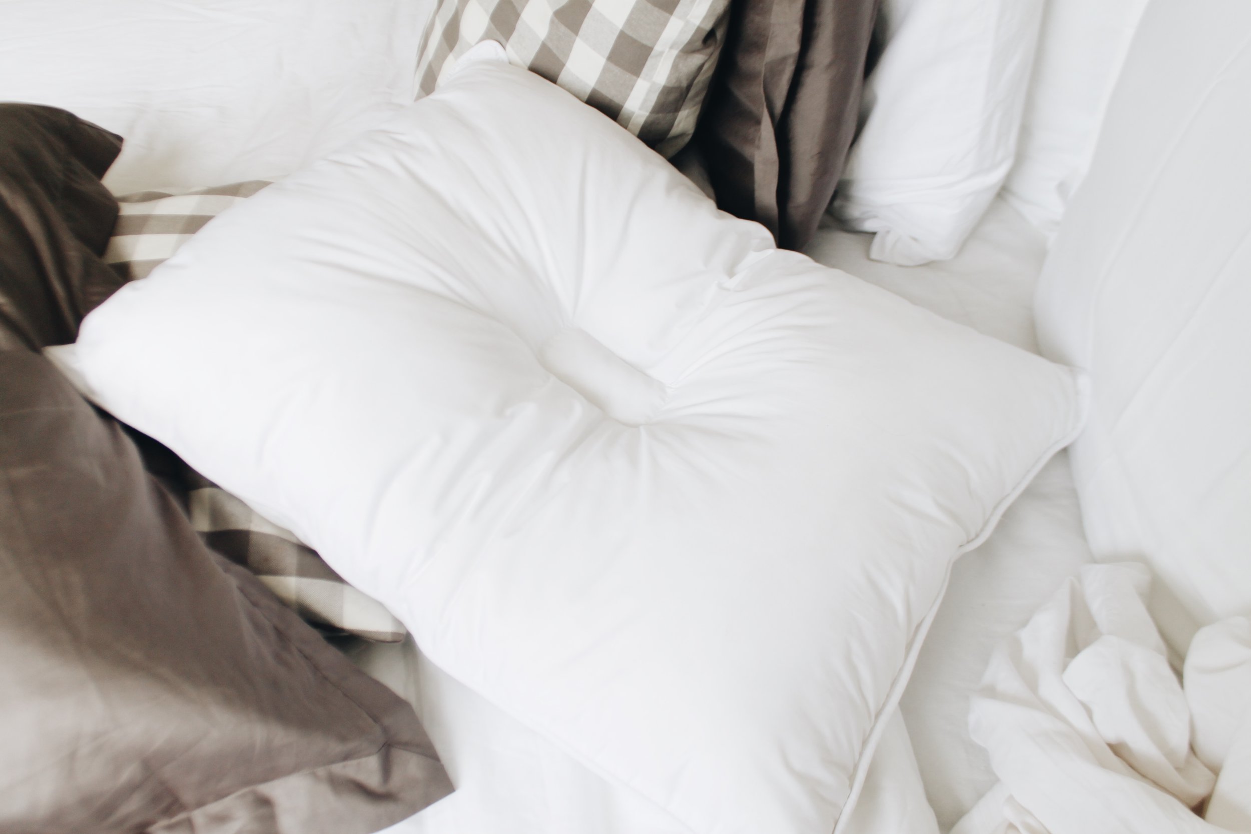
Our pillow inserts, duvet, and mattress pad are by SLEEPHI, a Boston based bedding startup. They're on a mission to improve sleep, and have a unique "climabalance" technology for regulating temperature throughout the night. The pillows pictures are these, and are designed specifically for back and stomach sleepers. You can see they have that indent in the center, it's designed to keep the spine aligned at all angles. After sleeping on it for weeks I can attest that these are great. Use code 10SLEEPHI for 10% off everything except the comforter, which is on backorder.

A tip for bedding shopping: even though we have a queen sized bed, I buy my duvet and duvet cover in one size up (king) so that it hangs off the sides more easily and is more forgiving to share. I buy the fitted sheet in a queen, and we don't use a flat sheet (European style, and less to deal with when you make the bed), and the duvet goes right on top, with extra blankets for the winter. I run cold so I bundle up.

Things we still need: matching nightstands and some kind of lighting (considering these). We painted all walls and trim before we moved in, and there is a tiny master bath in this room (not pictured, to the right of the dresser) that needs some TLC. Again, trying to focus on all that we have done instead of all that I wish we could do. The time constraints of having a toddler and doing it all yourself make for some good lessons in waiting patiently and being content with where you're at.

Shared in partnership with Boll & Branch and SLEEPHI.

Other sources: checkered pillow cases | letters | euro pillow inserts | large art by me | small art thrifted

ON DESIGNING WITH KIDS

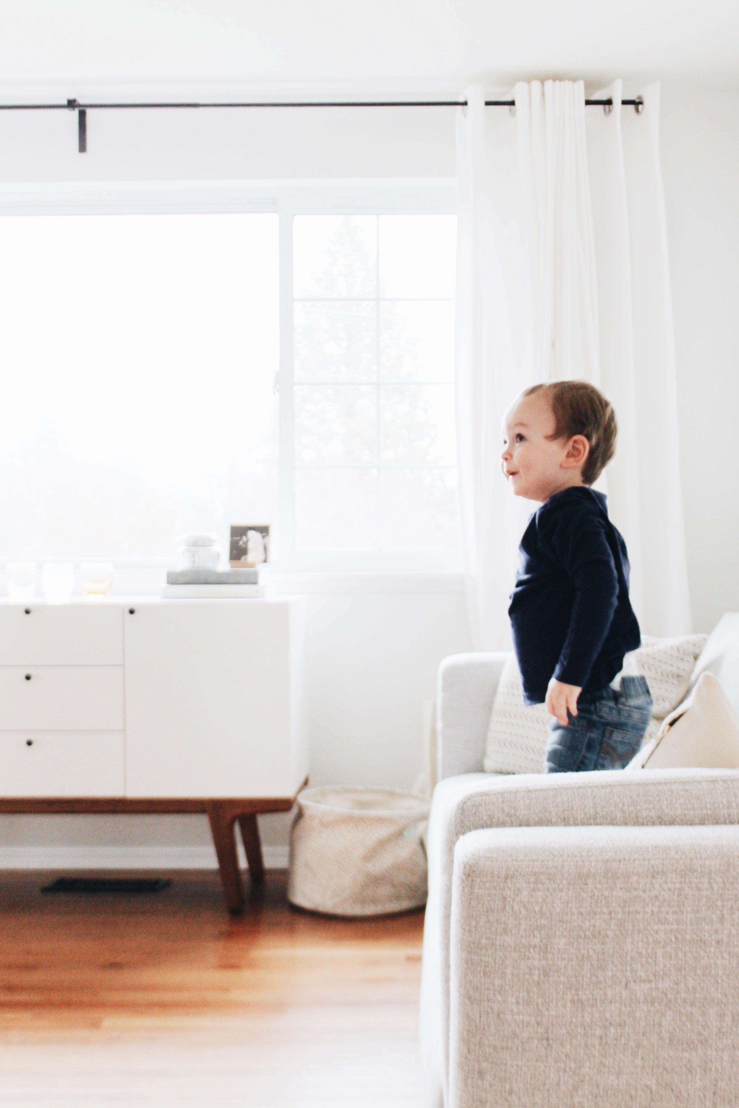
Picking a sofa was one of the hardest design choices for me so far in this house. There were seemingly endless options, combinations, deciding sofa vs. sectional, sizing, height/width/depth choices, not to mention deciding fabric on top of that.

I wanted something modern with clean lines, and that shipped fast (so many sofas I saw take 8+ weeks for production and shipping, and I didn't want to wait that long).

I found a selection of in-stock, mid-century modern sofas at Rove Concepts, a small company out of Canada. They were great to work with and sent me multiple fabric samples so I could see the colors in person, which I totally recommend if you are buying online. It's nice to see and feel the fabrics before you buy. The customer service team was super responsive and answered all my questions about double rub count and durability.

I polled my stories to ask which was the best fabric to choose with kids and got a variety of answers. Initially I was thinking I'd go with leather, since I liked the wipe-ability of it, but had also heard from friends that it scratched easily, or it was cold, and I wanted something that felt warm and cozy. Our floors are also a really rich warm tone and I wanted a little more contrast in color there.

I went back and forth forever, but ultimately, when with what I liked. Yes, the fabric is light, and yes, it might stain. But, this happens to be a very durable fabric (30,000 double rub count) and if something happens, there are stain treatments, and life will go on. I decided I don't want to design a house that's kid proof but I don't like looking at everyday. I want to LOVE the space I'm in. I want to design it for how I want it to look everyday, not in case of what happens someday.

I love it. It's extremely comfortable, fits the space perfectly, and is the right mix of polished and modern. The fabric lightens up the room, especially for Seattle's dark winters, and the polished stainless steel legs are a nice contrast to all the wood tones in our house.

Next up for this room: a rug that fits, possibly a tufted square ottoman/coffee table, reupholster a chair, and more seating. One thing at a time. It's hard to not focus on everything that hasn't been done yet, and forget all that's already happened. Even the layout takes time. We rearranged this room recently and it's amazing to see how one small tweak can really made such a difference. We're slowly making this house our home.

Sofa decision, check! It's already gotten lots of use.

A good reminder to design your house for YOU and not for Pinterest, your neighbor's house, your older kids, or anything else other than you life right now and what you like.

You'll be glad you did.

Sofa style is Nico in Arctic Grey Modern Tweed. Thank you to Rove Concepts for partnering with me on this post.